
Impossible Maps : The Power of Labels
This post is my short response to the following readings.
- “Sorry, We Have No Imagery Here”, Meg Van Huygen
- The first chapter of James Scott’s Seeing Like A State (pages 11- 52).
And my first map with GeoJSON data
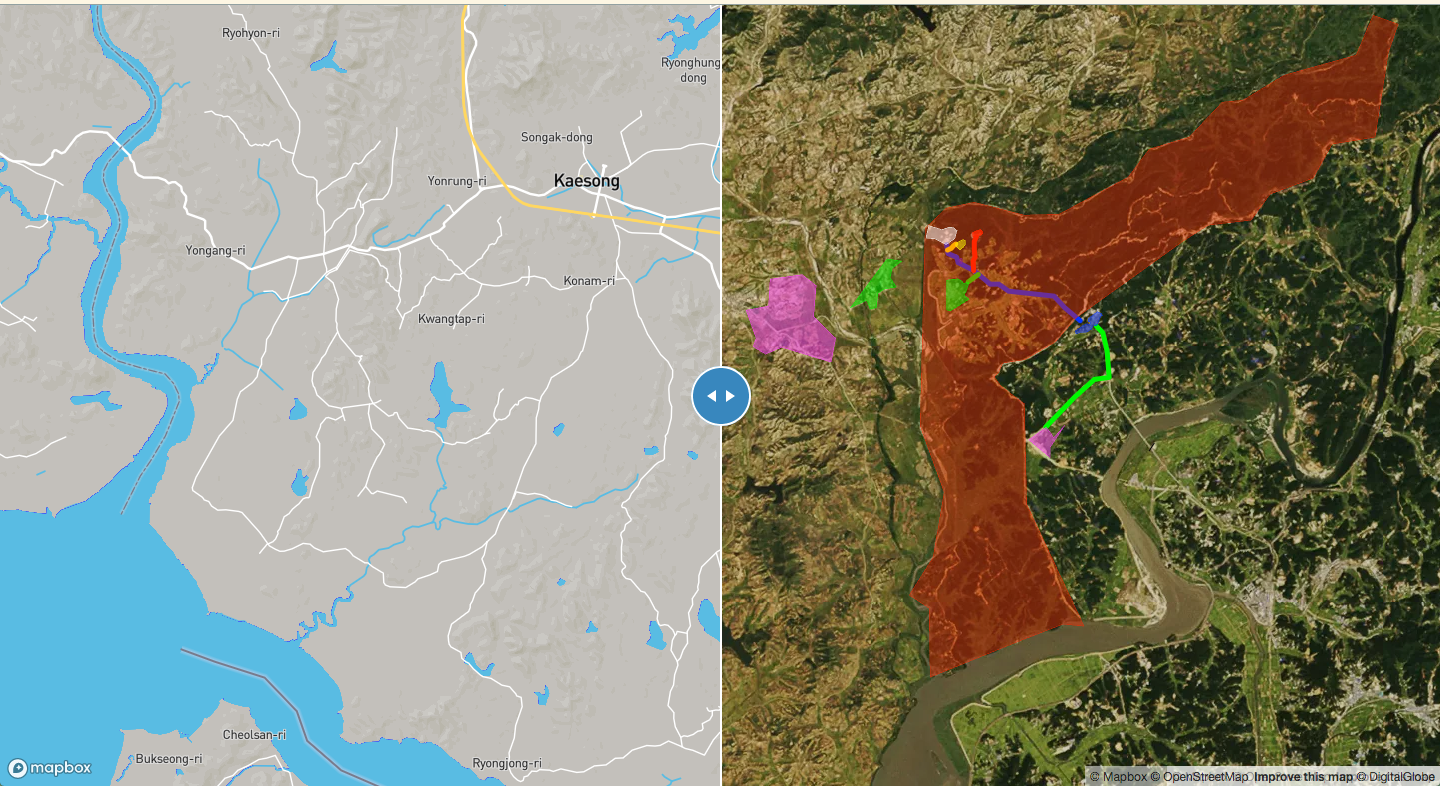
When I saw the satelite images (censored, hidden, blurred) from Meg Van Huygen’s article, I was immediately reminded of the Korean Demelitarized Zone between North and South Korea. It’s a buffer zone that stretches about 160 miles long and is about 2.5 miles wide. This special area remained untouched by humans after the Korean War that lasted from 1950-1953, but unlike its name “Demiltarized Zone”, the area is full of landmines and civilian access highly restricted. Here is a link to the wikipedia article if you want to learn more.
Because of the area’s sensitivity in terms of military, political and diplomatic significance, it is near impossible to find a detailed map of the DMZ. Especially in Korean maps powered by local tech companies like Kakao and Naver, the area is represented with plain gray-ish layer that only displays the very minimum road information. Google Maps also doesn’t do a good job of representing this area. I would guess the South Korean government has asked many map vendors to remove this area from their maps. I find this interestin because one can easily get more detailed information from Google Earth (if you bother to actually zoom into the area and look for deatils).
I decided to make my own map of this area, since I spent 2 years serving in the ROK Army under United Nations Command Security Battalion - JSA prior to coming to Olin for college education. You can find my version of the map here. I used geojson.io to indicate some interesting areas and routes. Then I used Mapbox GL JS and its Compare plugin to put an ordinary map and a satelite map next to each other. Here is a short legend for the map (which I couldn’t figure out how to display with Mapbox GL JS)
- The red area indicates the general DMZ area (full of landmines),
- The white area indicates the Joint Security Area (JSA, a.k.a the Truce Village of Panmunjom) and the NNSC camp
- The pink area indicates the Kaesong Industrial Complex,
- The green area indicates Dae-Sung-Dong and its North Korean counterpart Ki-Jong Dong.
- The blue area indicates Camp Bonifas where both the South Korean and the US forces are stationed at.
- The dark red area indicates Guard Post (OP) Ouellette
- The green route was a jogging route for everyday morning exercises (it eventually leads to North Korea)
In the process, I learned that labels have so much power in that they embue meanings, intentions, and stories to a seemingly banal representation of the world. Abstraction as mentioned in Seeing Like a State is achieved through how we choose to display entities in our representation. I found it very intersting that just adding some color polygons and lines on the map shifted my perception completely, from looking at a map of random roads to looking at a map of danger and alert. In some sense, being able to label things on a map indicates an ownership of special knowledge which I think directly corrsponds to one’s ownership of power. I was also surprised by the fact that I was able to find Wikipedia articels for most of the regions I labled). Thus we can infer that once a person has labels on a map then it become so much easier to access the detailed information about the area on the map.
I became curious of how other people have labled the area. So I did some google search and found several relevant sources. Each map is unique in that the labels indicate different perspectives. Please enjoy these maps of mine and others!


Leave a comment