Technology, Accessibility, Design : Adding Accessibility to my Personal Blog
I worked on my personal blog to make it compliant with WCAG AA accessibility standard. I did an accessibility audit of my website using the WAVE (web accessibility evaluation tool). I recommend installing the WAVE browser extension which supports both Chrome and Firefox. It’s a really nice tool that identifies accessibility flaws on a website and has solutions on how to fix them. With its support, I successfully eliminated all the major errors including the contrast errors, and my website is now (according to WAVE) compliant with WCAG AA standard. But this does not guarantee that it is fully accessible to users who are using keyboard-only interface or screen readers.
Initial Goals
This is the list of changes that I wanted to make in my initial goal.
- Add alt texts for all images (have text equivalent for images), videos (Perceivable)
- Update Headings (h1,h2,h3) hierarchy and navigation structure (Understandable)
- More specifically, the structure should be indexable by Apple Voiceover
- Update links so that they make sense (unlike Here)
- Add skip link to the main content
- Remove on hover JS events that don’t quite work at an keyboard-only env
Outcome
And here is a list of what I’ve actually accomplished. Please take a look at my pull request if you want to see the details.
-
Changed the theme to have appropriate color contrast
I’m using a Jekyll theme called minimal-mistakes. It supports a couple of color themes and it comes with a ‘contrast’ theme which passes most of the WAVE color contrast standards. But it still has a few subtle color contrast errors that I had to fix manually by inspecting the CSS. In the process, I learned that blue text on a white background is a good color combination to use if you are aiming for zero color contrast errors.
-
Update heading structures for home, project page
My blog was missing a few h1 headers and I had to update my layouts to have the appropriate heading levels. I could not update the broken headers on my blog posts (which use markdown headers) because there were sadly, so many of them. Fixing those headers is definitely one of my future moves with this blog.
-
Add
Skip to main contentlinkThe skip link appears when the user tries to navigate the website using a screen reader or a keyboard. Initially, I had used
style="display:none"to hide the skip link but the exact move was a violation of the WCAG standard. I had to use some css trick in order to pass the audit and I learned that a line of code can make huge difference to user who aren’t interacting the website with a mouse. -
Update links to have explicit context
Before I had links that said
Read moreor clickherebut I’ve updated the texts so that they tell the user about what the link is about. But I did not update every single link on my blog posts (was a little overwhelming, maybe an automation tool that can detect all the broken links on a domain would be super cool) -
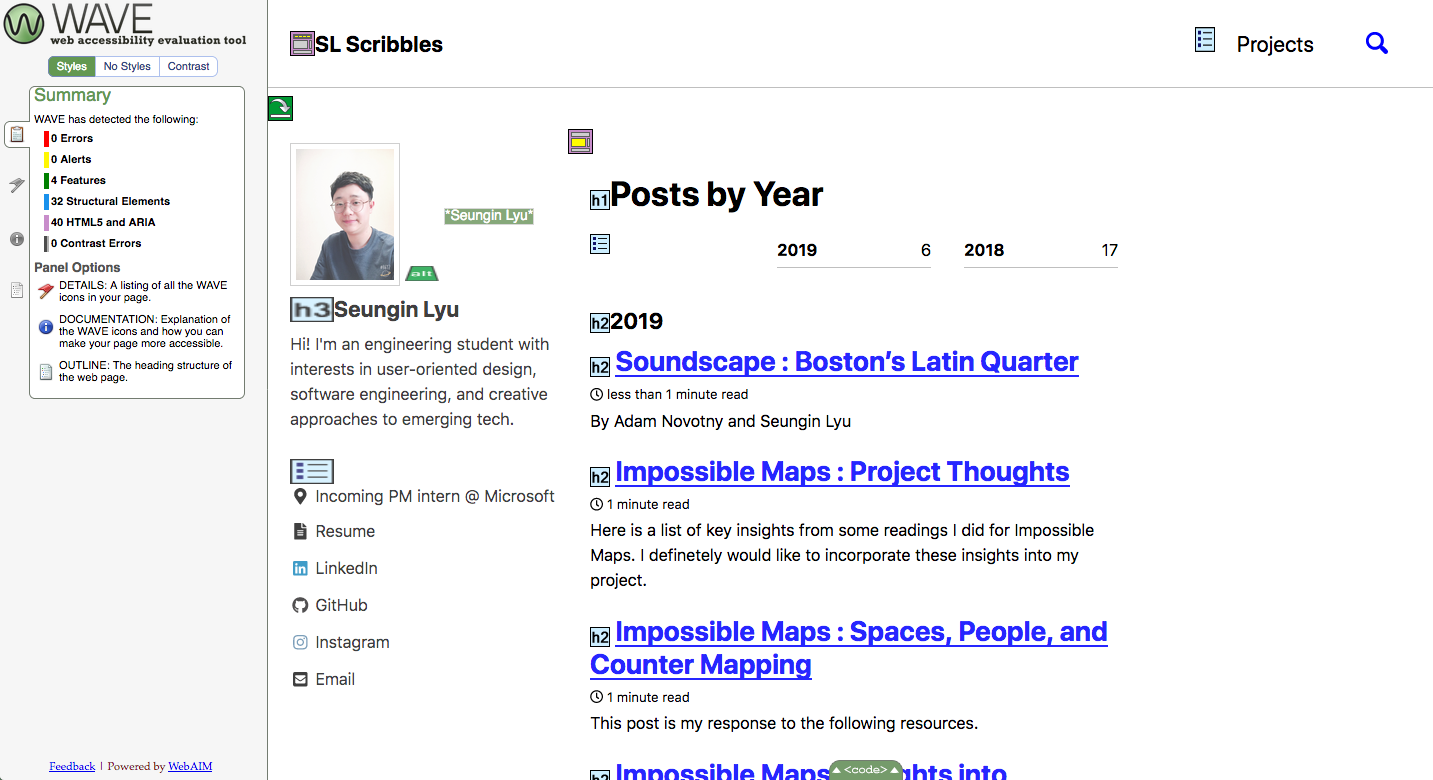
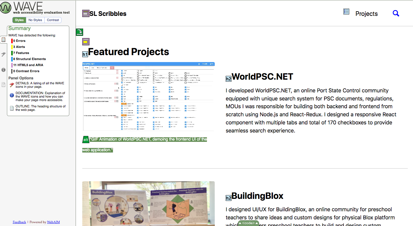
Add alt texts for project images
This was interesting because writing a good alt text is surprisingly difficult. I learned that including descriptions like “Image of Seungin” is a direct violation of the standard because an alt text should have what the image content is about and not what it is on a semantics level.
Reflection
Overall, I was very happy with my progress towards making my blog more accessible. But I learned that there is a lot more to be done. I’m glad that I’m aware of such challenges and the subtle implications of some HTML and CSS snippets that I was using without deliberation.
